
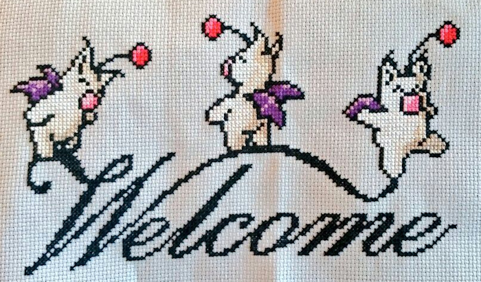
My daughter Elena loves to cross stitch. Occasionally, she uses patterns, but most of the time, she makes up her own. She favors retro designs that also pay tribute to the icons of her Millennial generation, such as this Welcome sign decorated with Moogles, a creature from the Final Fantasy game series.
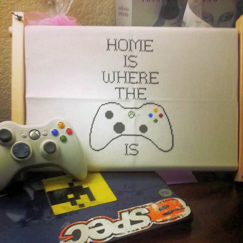
It’s the fun of mixing tradition with the Now that most appeals to Elena. She and her husband travel all over the country for his job (along with their game systems and controllers), so she made this cross-stitch for their hotel room:
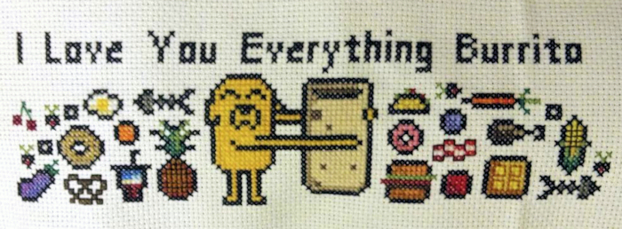
And while most people think of cross-stitch along with cats, afghans, teapots, and little old ladies, it’s hard to imagine a little old lady composing this cross-stitch, which features Jake and his Everything Burrito, from the television cartoon, Adventure Time:
I can’t do what Elena does. I’m left-handed, and my fingers are clumsy. I can’t draw or cut a straight line. I never learned how to cross-stitch, and I have no patience for counting patterns in crochet or knitting. So, when it comes to handcrafts, I have only one outlet for my creativity.
And you’re looking at it.
My website is my craft project. Like a quilt in the making, it’s bulky and hard to work with and sprawls across a lot of territory. At the same time, it’s relatively tidy, even when you look at the stitching on the back. I’ve worked on it for over a decade now, and I’ve never hired help, not even for the multiple-choice quizzes under the trilogy pages or for the conversion of my WordPress blog to match the rest of my website.
Unlike Elena, I could never do this:
But I DO know how to do this.
When I first started working on my website, I used a program that walked me through exactly how to set up a page. It was a couple of years before I started learning about how HTML and CSS codes work, but I’ve learned a lot since then. Now I spend all my time formatting the codes directly, without special WYSIWYG programs to hold my hand. The code for that cute text-shadow box, for example, looks like this:
I regulate the 142 pages on my website with nineteen templates, one template for each section of the site. That way, when I make a change, I can be sure that all the webpages in that section will change in exactly the same way. To control the appearance of my webpages, I’ve created one massive file, called a CSS stylesheet. This webpage, which has clouds and sky as its theme, and this webpage, which matches its book’s rustic, spooky medieval setting, both take their appearance from that same master document. If it went missing, they’d be nothing but black words on white.
I like to think that my website represents my personal style. But I also created and maintain Elena’s website, which has some pretty fun style elements of its own. I’m particularly proud of how I incorporated entries from her diaries into the website by combining scans of diary pages with scans of torn paper and then matching their backgrounds to the background colors of the different pages. Her website has a fresh, informal feel that’s very different from mine.
Last November, if you had looked at my webpages on a computer, you would have seen almost exactly what you see now. But if you had looked at them on your phone, you would have had a hard time reading them. The section menus were off to the side and hard to read, and the text and images didn’t resize to fit on a phone screen. So I began an ambitious overhaul of my site to incorporate what’s called “mobile design” or “responsive design,” a website that looks different on your phone or tablet than it does on a computer.
In order to make that change, I had to scrap my old CSS stylesheet, a document that was 1,304 lines long, and create a brand new CSS stylesheet, a document that is now 1,816 lines long. In the process, I had to change hundreds of little codes like the ones in the white box above. And then, when that new CSS stylesheet was ready, I had to change codes on every single page on my website to conform to it. And once that was done, in order to make my blog work with the new mobile design, I had to take yet another massive stylesheet–the blog’s stylesheet used to clock in at 1,376 lines long–and change almost every bit of that. The final blog stylesheet is 1,825 lines long. And then I had to edit all the PHP scripts that govern the structure of the blog pages and finally edit codes in each of the blog’s 144 posts.
That’s a lot of coding! It took me three months. But today it all works, more or less. My website and blog still match in terms of style, and they should display properly no matter what device you use to browse them. So I can go back to writing posts, not just coding them.
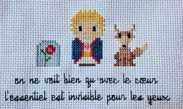
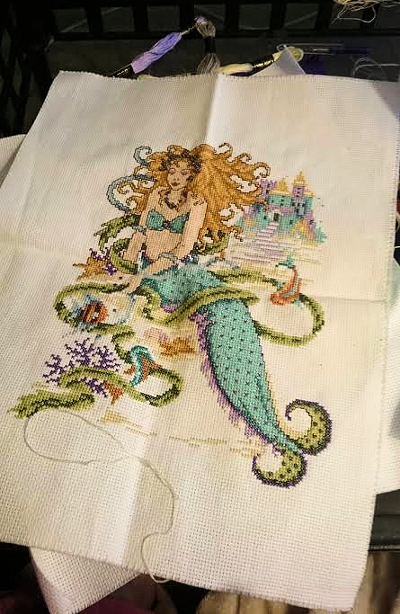
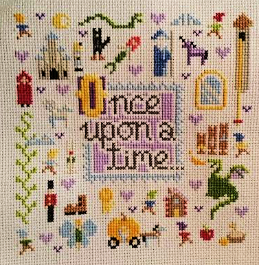
Elena had an extra scrap of cloth, so she created this delightful homage to The Little Prince. I could never do that. And I could never do this, either, which she whipped out in a couple of days with no pattern of any sort to send to her baby niece:
But, clumsy thumbs or not, I still have a craft.
And it’s right here.
Text copyright 2015 by Clare B. Dunkle. Photographs copyright 2015 by Elena Dunkle. To read my latest blog posts, please click on the “Green and Pleasant Land” logo at the top of this page.